Why Is the Toucan Our Symbol? A Journey Into KepGuide's Colorful World
Discover the story of the toucan, the soul of our logo and brand, and how it reflects our approach to diversity and hospitality in tourism.
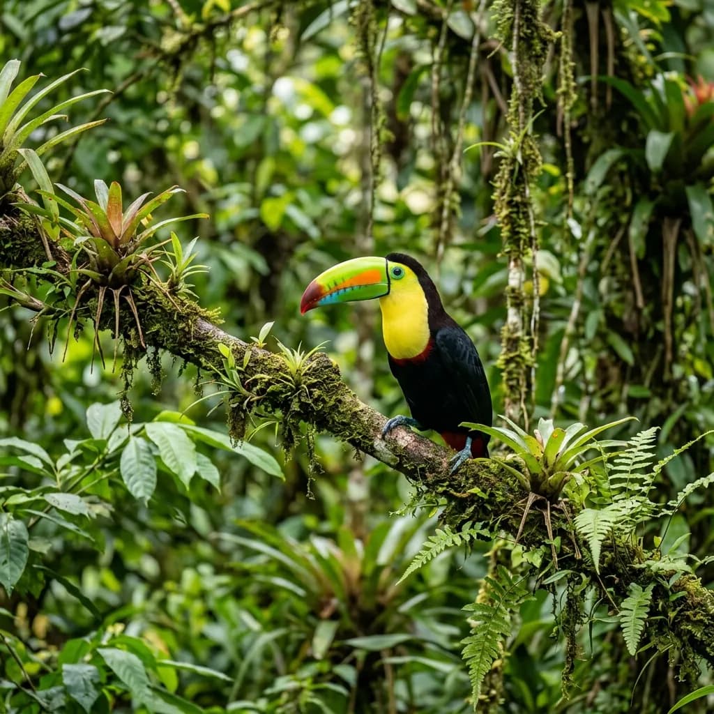
At KepGuide, from our logo to our website, you must have noticed our colorful, big-beaked friend appearing in every corner: the Toucan. So why an exotic toucan instead of an Aegean or Mediterranean bird? This choice wasn't random — it reflects a deeper brand philosophy.
Color and Diversity
The toucan's most distinctive feature, its magnificent, colorful beak, represents diversity for us in the tourism world. In the KepGuide universe, there's always accommodation to fit every budget, taste, and dream. Just like the color gradients on a toucan's beak, we offer a wide range of options — from luxury villas to boutique hotels, from peaceful nature retreats to vibrant city hotels.
Nature's Social Architect
Toucans are quite social and peaceful creatures in the wild. That's exactly our approach to tourism: to be a platform that brings people together, hosting new friendships and unforgettable memories. We combine the toucan's energy with the warm, sincere welcome behind our motto, "Feel Like a Host, Not a Guest."
Rare and Special
The toucan is a rare, special figure, instantly noticeable wherever it appears. At KepGuide, we aim to go beyond being just another booking site. We don't just offer you a room — we offer our "Signature Properties," places we've personally visited and whose quality we trust. Just as a toucan stands out as a rarity in the forest, we seek out the most special corners for you.
Why an Exotic Bird for Turkish Tourism?
The answer lies at the heart of our branding strategy. Even in its native Central and South American forests, the toucan is instantly memorable at first glance. We wanted the KepGuide brand to be just as memorable in the Turkish vacation market. By avoiding expected, generic symbols like a seashell, a palm tree, or the sun, we chose to create a unique and distinctive visual identity in the industry — one that sets our brand apart from other booking platforms at first glance.
Color Palette and Brand Identity
The orange, yellow, and green tones of the toucan's beak are reflected in KepGuide's corporate identity as well. This warm, energetic color palette is designed to give users a subconscious sense of vacation and enjoyment while browsing our platform. That's exactly why we chose warm, inviting colors over cold, corporate blue tones — because planning a vacation should be a joyful process, not a stressful one.
A Message of Sustainability
Toucans play a critical role in the ecosystem balance of the tropical forests they inhabit, spreading seeds that help the forest regenerate. This natural role mirrors our own approach to responsible tourism: at KepGuide, we prioritize vacation options that support local economies, respect nature, and promote sustainability.
- Visibility: Noticeable, transparent service, just like the toucan.
- Adaptability: Flexible solutions for every kind of vacation need.
- Energy: The vibrant, positive spirit that vacations bring.
- Originality: A unique, memorable brand identity in the industry.
In short, the toucan isn't just a visual for us — it's the joy of vacation, the excitement of discovery, and the colorful face of professional service. Get ready for an unforgettable experience guided by the toucan on your next trip!